Thursday, 15 May 2014

Flash Fiction - One day Brief

On this one day brief I had to produce a series of 12 images, each symbolising an adjective that we were given at the beginning of the day. 

I decided to base my series of small images on a makeshift journey of a working class family. Travelling, and  documenting what they saw, did and ate. 
I tried to produce images in the first person view, to make the images look as if the family saw it this way.   


Deep
Looking down over a bridge that they are crossing on the way into town.


Disgusting 
A parent has just been smoking, and has stubbed their cigarette out using the bin.


Abstract 
This is something that they saw as they travelled. 


Spicy
Stopping at McDonald's for a bite to eat. 


Small
Finishing their meal, trying to use all the ketchup they can on the last bite.


Bland
One member of the family takes some food with them, but discard it quickly as they are bored with its taste. 


Blue
The view of the family from the view point of a passer by.


Contracting
Another view that they saw, this time making their way back home.


Bright
One of the children gets enticed by the bright colours on a toy machine, and bugs their parents into playing.  


Tall
A traffic light that comes into view as they are about to cross the road. 


Square
They look up at their building before venturing inside. 


Blurry 
The children, and parents become tired.

Leeds Gallery

On the same day as the White Cloth visit, we also visited The Leeds Gallery where they had a photography exhibition by Casey Orr. The exhibition was entitled 'Saturday Girls'.
The exhibit featured photographs of different women and girls, all in different clothing and hair styles. The work is actually about how young people are seen their hair, how it effects them, and what it makes us think about them.
Individuality or belonging to a tribe? It not thought much about, but they someone style the hair growth on your head says a lot about yourself. Its all about choices, the way we think and act all play a role in ourselves. 


White Cloth gallery visit

On this later trip to the White Cloth gallery we saw two new photography exhibitions. One by Slim Aarons, and the other by Gered Mankowitz. Both very different work.


The first exhibition was the Slim Aarons photo work.Working mainly for publications, Aarons photographed the famous. As well as photography the high society he also worked for the S military magazine called 'Yank' during the Second World War.

His main work of the photographed rich has featured in an array of publications. including Venture and LIFE magazine. 

His work was a positive portrayal of the wealthy, and because of this class accepted him into their society.  


The second exhibit in the White Cloth was the Gered Mankowitz photographs of Jimi Hendrix. These works are extremely famous, and the prints that he has produced are still being printed today. Used for posters, T-shirts, and practically anything that can be printed on. 

Within this collection, there is a mixture of the original black and white, and the new updated images which have been digitally touched up, adding bright bold colours to the black and white photographs. 
I personally prefer the original ones over the new ones. They seem more intense and raw, just like the music that the artist produced. the coloured ones I think look overly bright, and a bit too much in your face. We all know that Hendrix was known for his 'wacky' clothing, and the artist who produced the coloured images probably just wanted to accentuate them, but i believe the images were more about himself as a human, than about his choice in clothing.  


Thursday, 20 February 2014

Berlin

A week Berlin, I have to say was not long enough. It's probably somewhere that I will carry on visiting throughout my life time (fingers crossed!) 
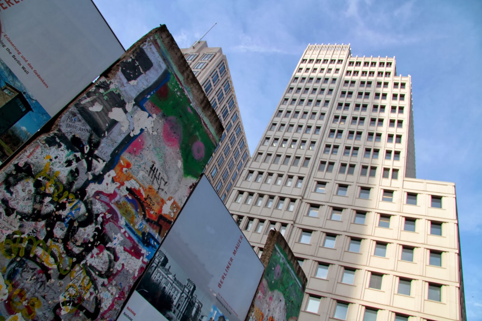
Even though I saw so much (The Reichstag Building, Brandenburg Gate, The Berlin Wall, The Jewish Museum, The Berlin Zoo and countless galleries) I could definitely return not have to repeat anything. 
It's such an unconventional city, and nothing like what I expected it to be, and yet I am already looking forward to my next visit.   


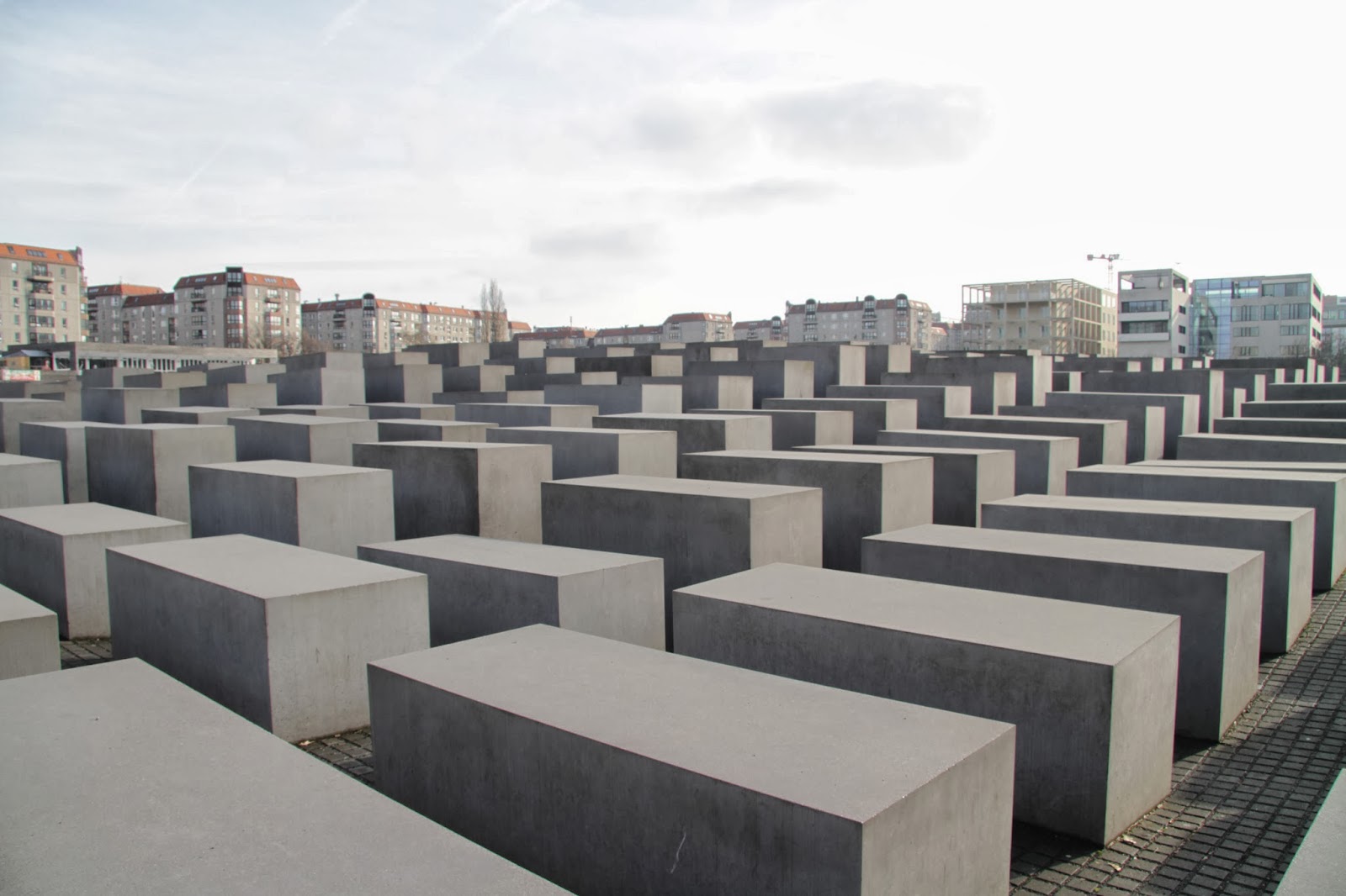
The Jewish Memorial


One added bonus about this city was the traffic lights, and especially the pedestrian crossings! 
How can you not like a crossing light that wears a hat?


Outside the Reichstag Building


Inside the dome of the Reichstag


Berlin from the window in a gallery tower. 

Fashion Editorial

This was a group project where we were given a brand and a magazine and then left to our own devices to decide what we would do for the brief.
We were given the brand Vivienne Westwood and the magazine Elle, and we had to produce a fashion editorial for that magazine. 

Researching firstly into Westwoods autumn/winter collection for 2013 we found that she had produced three different collections. Anglomania was one of her staple mad fashion collections which we decided would be too much because Elle magazine usually only features wearable clothing for the 20's to 30's. Instead we chose to base our clothing on her Red Label. This collection was far more wearable, very smart yet still young enough to be worn by the age group. 

Climate revolution was a big part of Westwoods collections. It was all about the reusable, making do and the natural. It related to her clothing but it also related to climate change, and how we could try and reduce or even stop it. 
Because of this we chose to use a natural environment for our fashion location. One of our group members found wood/forest area, and after analysing it we decided this would be a great place to shoot at.

The images below show our actual fashion editorial in its final layout.      


Page 1 and 2


3 and 4


5 and 6


7 and 8

I am personally really happy with our outcome, and believe that it fits the brief that we were given.  


Tuesday, 21 January 2014

Studio Portrait Final Piece


After three test shoots, discovering what would make the best visual representation of my subject I finally produced a roll of 120 medium format film. 
Using 100 ISO film speed to produce the sharpest image I could I developed a positive result of negatives. 
This was a huge relief!
The next stage (the enlarging), all 15 hours of it was one of the stressful elements I done within photography. But like anything in life, anything that takes time and  concentration is usually worth while, and it was definitely that! 
After hour apron hour, and many sheets of photographic paper I finally discovered the correct enlarging elements for my particular exposure. 
I believe it was definitely worth while, and I am very pleased with my final A3 print. Even though it took a lot of effort I can't wait to get stuck into my next film based work!


Saturday, 2 November 2013

7: Key and Fill Lighting

Studio set up 1

For my first studio set up I chose to use four studio lights; two lights at the back to be the fill lights and two key lights on either side in front of the subject. The back studio lights had reflector umbrellas and the front studio lights had soft umbrellas on.  
Using 100 ISO and 1/125 shutter speed, I used a light meter and measured that I would need F/20 aperture.   


The fill light is very easily shown in these photographs as the background is pure white with no hint of shadow or grey. 
Another reason why there is no shadow from the sitter is  because they are stood about 2-3 meters from the white backdrop.  
I like how the background is pure white, it gives the images more clarity and  more emphasis on the subject rather  than the background.

Studio set up 2

This time I only used two studio lights and chose to use soft boxes rather than umbrellas. I wanted to see what difference this type of lighting technique would make to the images I took on the other shoot.  
I still used 100 ISO and 1/125 shutter speed. I measure the aperture using a light meter. I chose to set the flash to 6 on the key light and that gave me an aperture of F/16 on the mid-tones of the sitters face.
With my fill light I chose to set the light level to 5. I used the light meter again and got a reading of F/11. There is a half a stop difference between the two apertures and because of this I rounded the aperture up to F/20.


(Sorry Charlotte)
These are two of the images I produced using this lighting technique. 
As the name implies (soft box) it produces a very soft lighting effect on the subject. The face isn't overwhelmed with light and you can clearly see the contours of the subjects face. 
But what I don't like is the dirty grey background. There may not be any shadow which I am happy about, but I would have preferred the white backdrop to appear white on the photographs. To get that effect I guess that I would have to use the other two studio lights with the reflecting umbrella like in my first studio set up.